Overview
This operator allows the user to create and modify shapes to extract areas of interest. It is at its heart an elaborate cropping operator. The geometric properties of the shapes will ultimately decide the eventual splitting operation while the stylistic options are meant to help the user organize their workflow. Once fine tuning is complete the user can export the areas of interest into new data sources. The exported files can be automatically loaded into the data manager or saved out to the file system. There is also an additional option to control the orientation of the split data to aid in further analysis.
Getting There
The Splitting Operator can be accessed and launched via the operator pull-down menu on VivoQuant’s front panel.

The default widget will then populate into a UI pane.
Using the Operator
The first step in using the splitting tool is to choose a geometry, the options are Rectangle, Cylinder, Rectangle Group and Cylinder Group. These basic shapes the user will modify to fit their desired areas of interest. The geometric properties will ultimately determine the final extraction export.
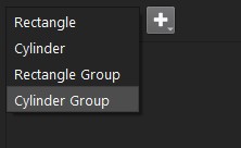
The next step is to click the + button and expand the dropdown shape creation options. The option labeled New (Data State) will create the shape with initial values that correlate well with the loaded data. The initial defaults in this mode will be based on proportions of the currently loaded data size. This is a good way to start fresh, especially when using a new data source. The second option labeled From Saved State allows the user to load a previously saved shape of the current type. If no saved shape of that shape type is found a pop up will alert the user than one was not found and how to go about creating one. See Saving State. A new shape created in this mode will not be automatically correlated with the data and will keep the saved values unchanged.

Once the shape is created and selected the fields of the shape will populate in the dialog.
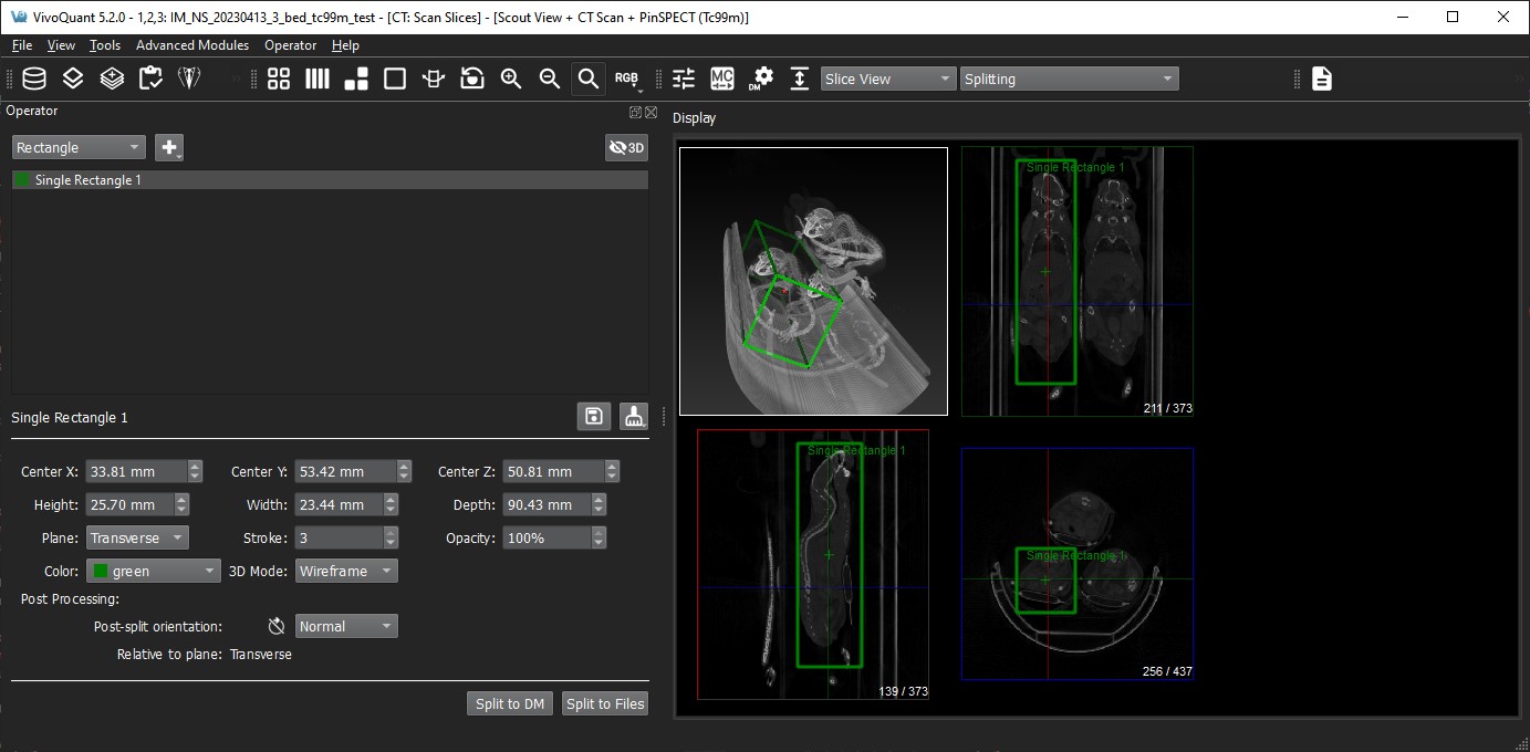
Rectangle
The center options will adjust the position of the rectangle in three-dimensional image space, while the height, width, and depth values will be defined relative to the currently selected plane. Stroke and Opacity can be used to change the visibility, color options are provided for visual organization, and the 3D Mode is used for additional adjustments within the 3D view, see 3D Support. The user can also manipulate the shape in the 2D slice views by dragging the corners of the rectangle or the center marker.
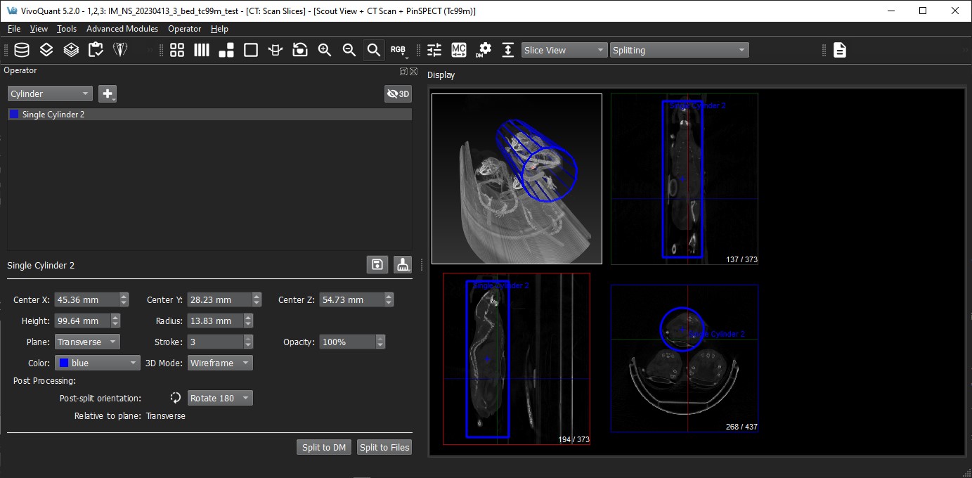
Cylinder
The center options will adjust the position of the cylinder in three-dimensional image space, while the radius and height values will be defined within the currently selected plane. Stroke and Opacity can be used to change the visibility, color options are provided for visual organization, and the 3D Mode is used for additional adjustments within the 3D view, see 3D Support. The user can also manipulate the shape in the 2D slice views by dragging the circle edge of the cylinder, the corners or the center marker.
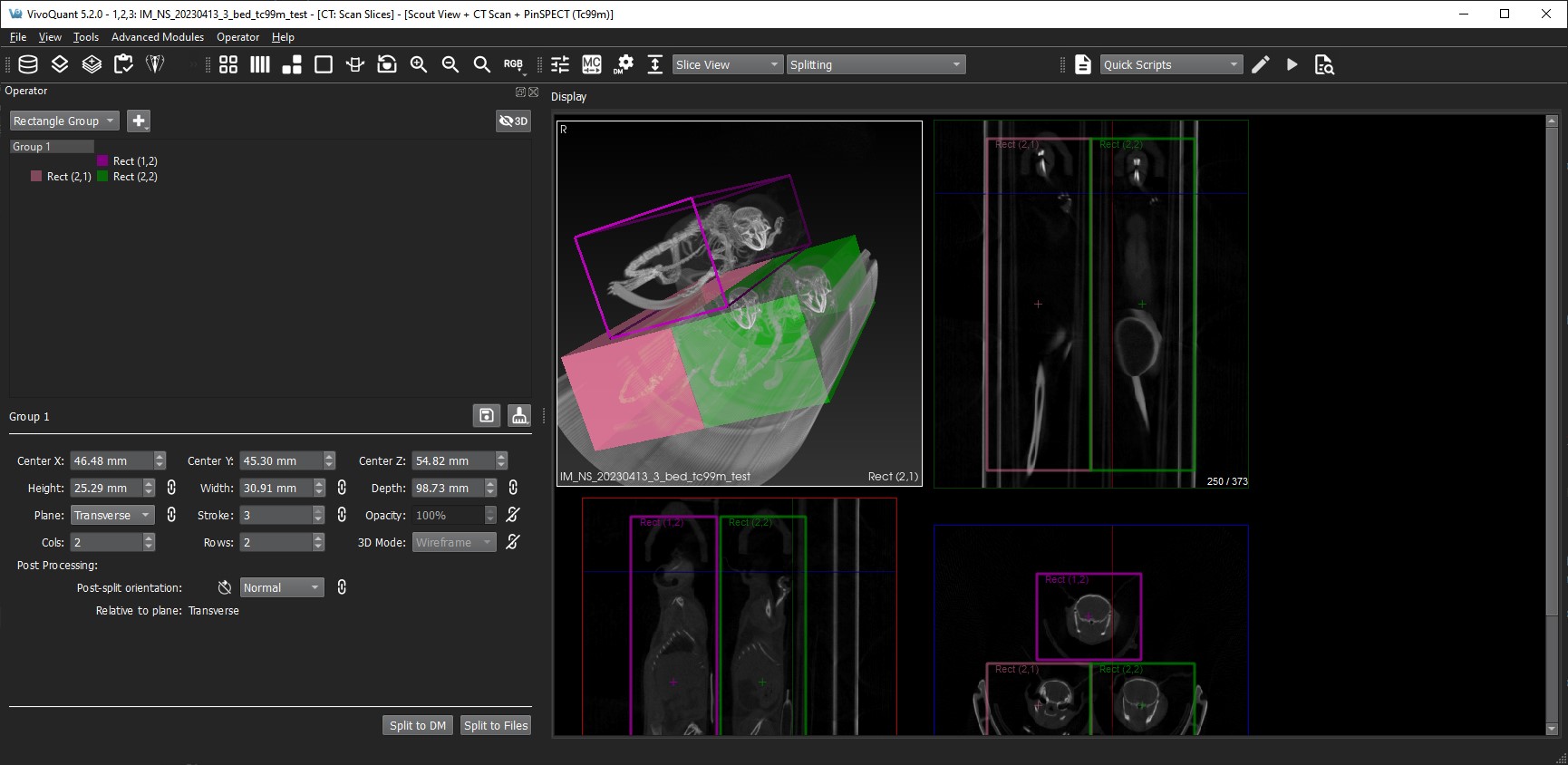
Rectangle Group
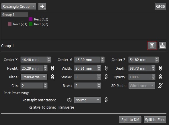
The Rectangle Group option has two modes based on selection: one for editing the entire group of rectangles and the other for individual rectangle editing. They both work in the same general fashion as discussed in the previous Rectangle section. Group editing is performed when the Rectangle Group name is highlighted as shown in the image below. You will notice the additional fields to adjust the number of rectangles via rows and columns. The center values for the Rectangle Group represent the center of mass of all the children’s rectangles and can be used to move all the children by the same amount.
Cylinder Group
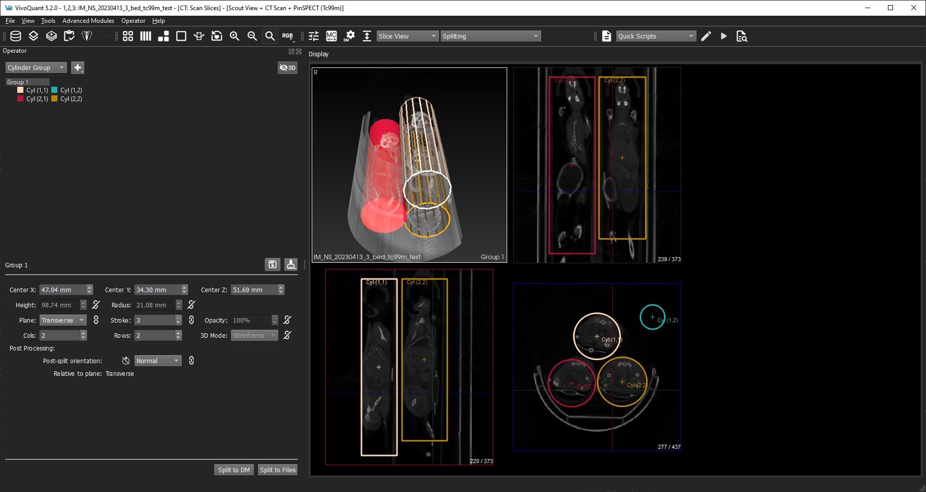
The Cylinder Group option has two modes based on selection: one for editing the entire group of cylinders and the other for individual cylinder editing. They both work in the same general fashion as discussed in the previous Cylinder section. Group editing is performed when the Cylinder Group name is highlighted as shown in the image below. You will notice the additional field to adjust the number of cylinders via rows and columns. The center values for the Cylinder Group represent the center of mass of all the children’s rectangles and can be used to move all the children by the same amount.
Group and Child Linking
As can be viewed in the previous two images, there are link icons next to certain shape fields. These links symbolize the current state of the group’s children regarding the context of that field and show whether all the children share the same group value or not. If the user wishes to overwrite one of the individual child settings, they need only to relock the corresponding icon.
Output
The image below show the fields that are relevant to the export of the splitting.

There are two options for exporting the split results. The first is splitting to the Data Manager triggered by the button labeled Split to DM. See Data Manager for more information. The second option for export is to Split to Files. All geometries that are currently listed will be exported as files. The file name that you specify will be prepended to the name of the geometry. Care should be taken not to overwrite older data that was previously saved.
The post-processing orientation will be applied after the extraction phase and is an additional tool for further analysis and organization.
Save Shape State
Once a shape has been created you will see a save floppy disc icon to the right of the current shape title as seen in the image below. At any time, the user can click that button to save the current state of that specific shape type. A note should be made here that we currently only support one saved version for each shape type. If the user requires more variety in saved states they can use the Operator Menu capabilities.
Revert Shape State
To the right of the save floppy the user will see the broom icon that has two options for reverting state. The first option labeled Previous State will set all the shape values back to either the initial state or the state when the saved icon was last clicked. The second option labeled Data State is a way for the user to correlate their current shape settings to the currently loaded data source. This option addresses the case where new data has been loaded that maybe doesn’t currently correlate well to the current shape. This option is similar to creating a shape with the New (Data State) except only the values associated with position and size are updated.

Operator Menu
The Splitting Operator toolbar options consists of a Load Shapes option and a Save Shapes option. Both options launch a file dialog to complete the requested action. The load option will replace the current splitting shape list with the newly loaded list and correspondingly the save option will save the entire shape list. The file type is XML.

Sessions Support
When saving out sessions the entire shape list will be captured in its current state, and when loading a session, the current shape list will be replaced by the shape list in the saved session. See Session for more information.
3D Support
The 3D View supports picking and hovering and will display the current shape name in the status text in the bottom right of the view. If no shape is currently being hovered over the status text will return to the currently selected shape name. Rendering in 3D can be globally turned on and off for all split shapes via the button in the top right corner.

Additionally, the individual shapes and shape group have a 3D rendering control which not only includes the ability to turn them off individually but also allows choosing between a solid vs wireframe rendering.
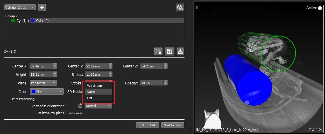
The 3D view supports full editing of the split shapes via the UI field controls or via interacting with the 3D rendering. The editing using the UI field controls is no different than editing in the slice views and should work as expected.
3D Editing
In order to the interact with the 3D shape rendering the user can click the Edit in 3D button. This button is present on individual shapes only and is enabled when the main Show in 3D button is also enabled. Once the button is depressed the edit widget will appear around the currently selected shape.
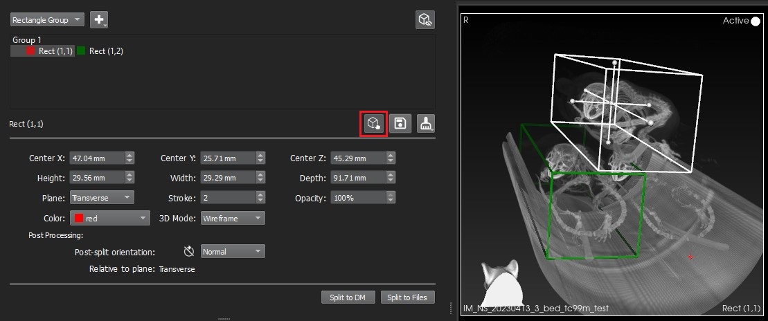
This edit widget has 7 control points; 6 are for dragging the boundary of the shape and 1 is for dragging the center position of the shape. Other edit widget controls are invoked via the following mouse and keyboard sequences:
| Key | Mouse Button and Action | Context | Description |
|---|---|---|---|
| N/A | Right down and drag | Cursor over edit box | Uniform scaling |
| Shift | Left down and drag | Cursor over edit box | Translates |
| N/A | Middle down and drag | Cursor over edit box | Translates |
3D Quick Editing
We also have provided another means to edit without first clicking the Edit in 3D button. This quick edit method should speed up 3D edits where users wish to change center or do a uniform scaling. These behaviors are invoked via the following mouse and keyboard sequences:
| Key | Mouse Button and Action | Context | Description |
|---|---|---|---|
| Alt | Right down and drag | Cursor over any shape | Uniform scaling |
| Alt | Left down and drag | Cursor over any shape | Translates |
Note: The 3D view must be in focus for ALT key to engage.
Once the user enters a quick edit context any current edit widget that may have been visible will be turned off.